

I am sometimes asked how one should decide where the red, yellow, and green regions for a fever chart should go. In this post I will talk about the basics.
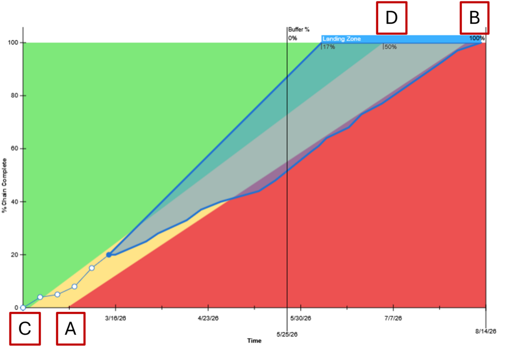
There are really four points whose vertical positions we have to decide on in order to define the regions: A and B, which are the start and finish of the yellow/red boundary; and C and D, the start and finish of the green/yellow boundary. A and B are the most important, because the red region implies a need for serious management attention. B must be enough before the end of the buffer to allow a reasonable chance to bring the project in on time, even if there’s a last-minute delay. A must be enough after the 0% point to accommodate reasonable startup delays, without starting so late that serious startup problems may go unattended. Depending on the environment, point A could be anywhere from 10% to 40%.
Points C and D define the yellow region, where we start to say, “this project’s status may not be ok.” This is where senior management may start to pay attention. Generally point C will be at the origin, because any startup delay should provoke some concern. Point D is the fuzziest. How close it is to B depends on what kinds of attention and actions you want the yellow region to trigger: closer to B means less warning that status is approaching red.
There is another way of looking at this. Suppose we explicitly define the green region to be the area in which you have a 90% or greater chance of finishing on time without significant management intervention, and the yellow region the area that gives (say) a 50% or greater chance of finishing on time. If we had perfect knowledge of all the probabilities in play, those regions would not be bounded by straight lines. Without perfect knowledge, we can still estimate positions for the AB and CD lines to approximate our sense of where those regions are. We do that by making the tradeoff between the wasted management attention if the fever chart says the project is in trouble, and it really isn’t; versus the increased chance of being late if the fever chart says the project isn’t in trouble, and it really is.